
OffsetTravel
While participating in the UX Writing Academy by the UX Writing Hub, I spent 3 months developing a user experience for an e-commerce site focused on conscious consumption of sustainable travel gear.
Since I am a lover of travel and passionate about sustainable living, I wanted to design an experience that would offer a new way to shop for gear that leaves less of a footprint. This site would guide users through a shopping experience while planing their next big adventure.
The scope of this project includes:
Competitive research
Design
Writing
User testing
The Problem.
Travel costs time, money, and valuable resources. Excessive air travel causes harmful Co2 emissions, lavish resorts limit natural habitats for wildlife, and unconscious production of travel gear and clothing is generating more and more waste on the planet each year.
With all of this in mind, I wanted to create a product that would educate travel communities on the environmental benefits of sustainable travel, as well as provide a space to purchase sustainable travel gear right then and there.
Research.
Competitor Analysis
To find both indirect and direct competitors for comparison to my future product, I looked for the most popular websites travelers use to shop for gear. I also looked for online stores and companies that value sustainability.
Top Competitors:
REI Co-op
Dick’s Sporting Goods
Patagonia
Columbia
Back Country
Sustainable Travel & Living
Bergans
Amazon
Insights:
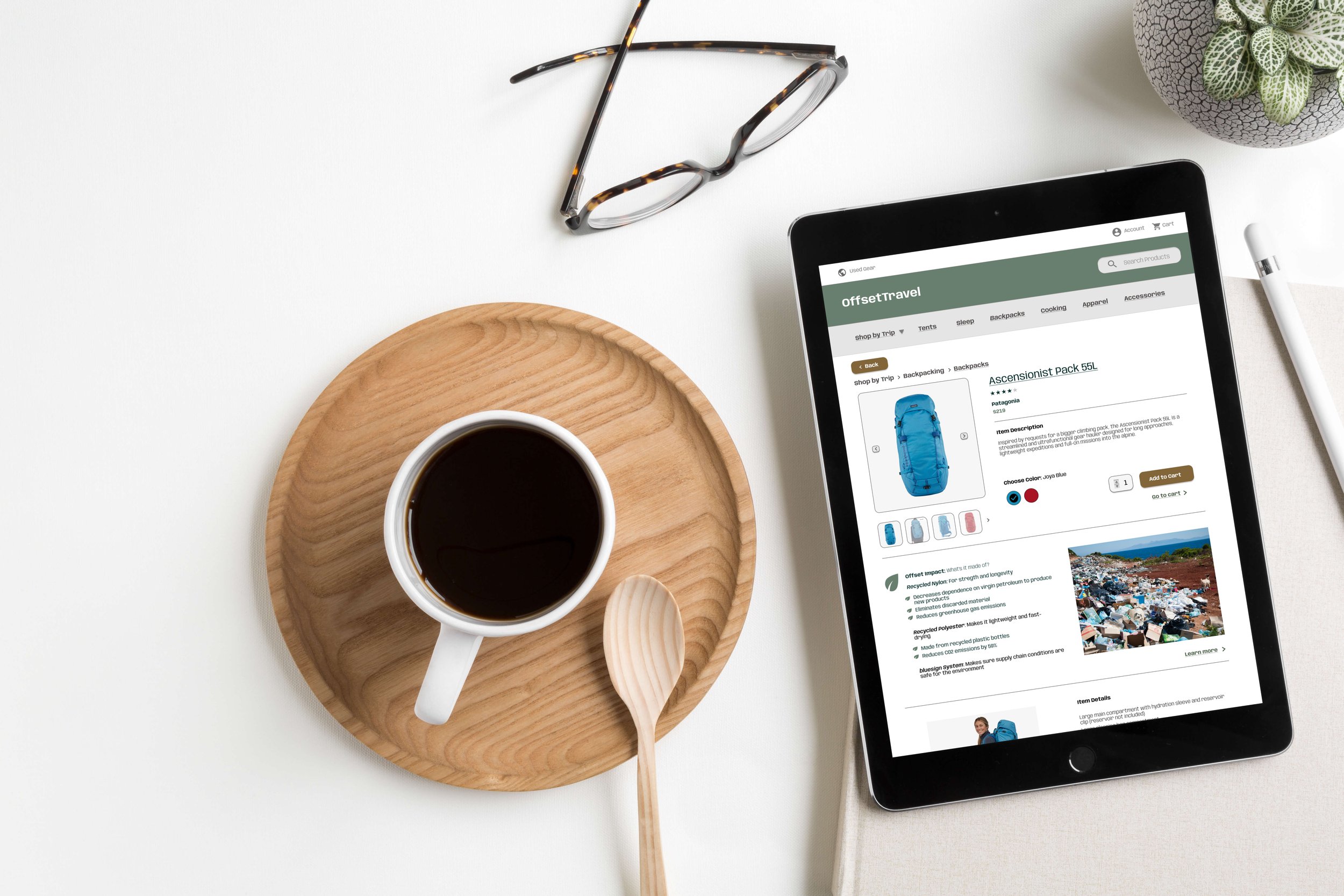
I noticed that the sustainable-focused shopping sites had either an “environmental impact” or “why” section on each product page. These sections explained how materials used to make the product were recycled or sustainably sourced and how this contributes to environmental solutions.
Options to donate to an environmental cause during checkout stood out to me. And I liked how sites like Patagonia have a recycled gear page in which users could send old gear in to be refurbished and resold.
User Survey
I used Google Forms to craft a survey that would allow me to gain insights into the behaviors and preferences of users.
I had 7 participants sourced from my personal network of travelers who expressed interest in environmental health.
57% male, 42% female
All aged 26-34 years
71% selected backpacking/hiking/camping as their adventure of choice

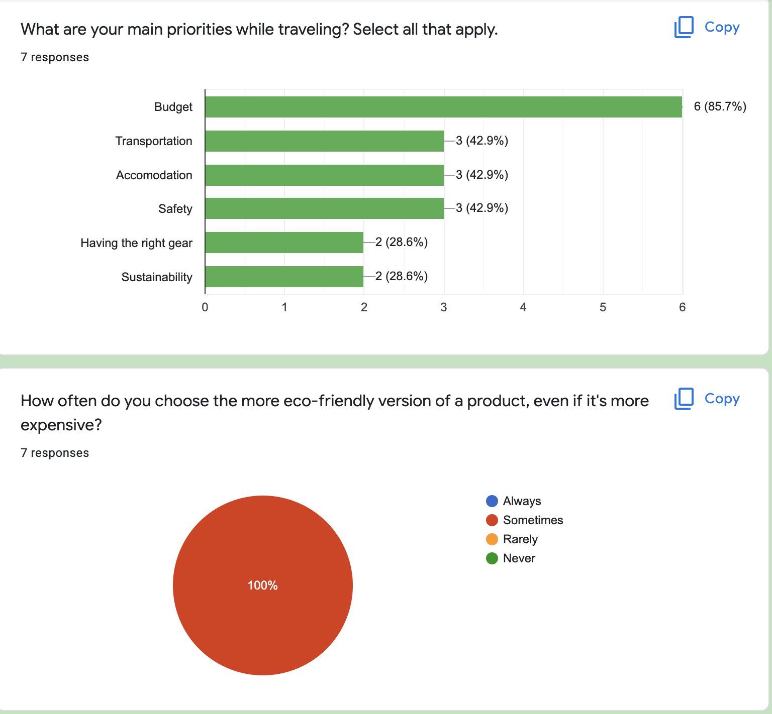
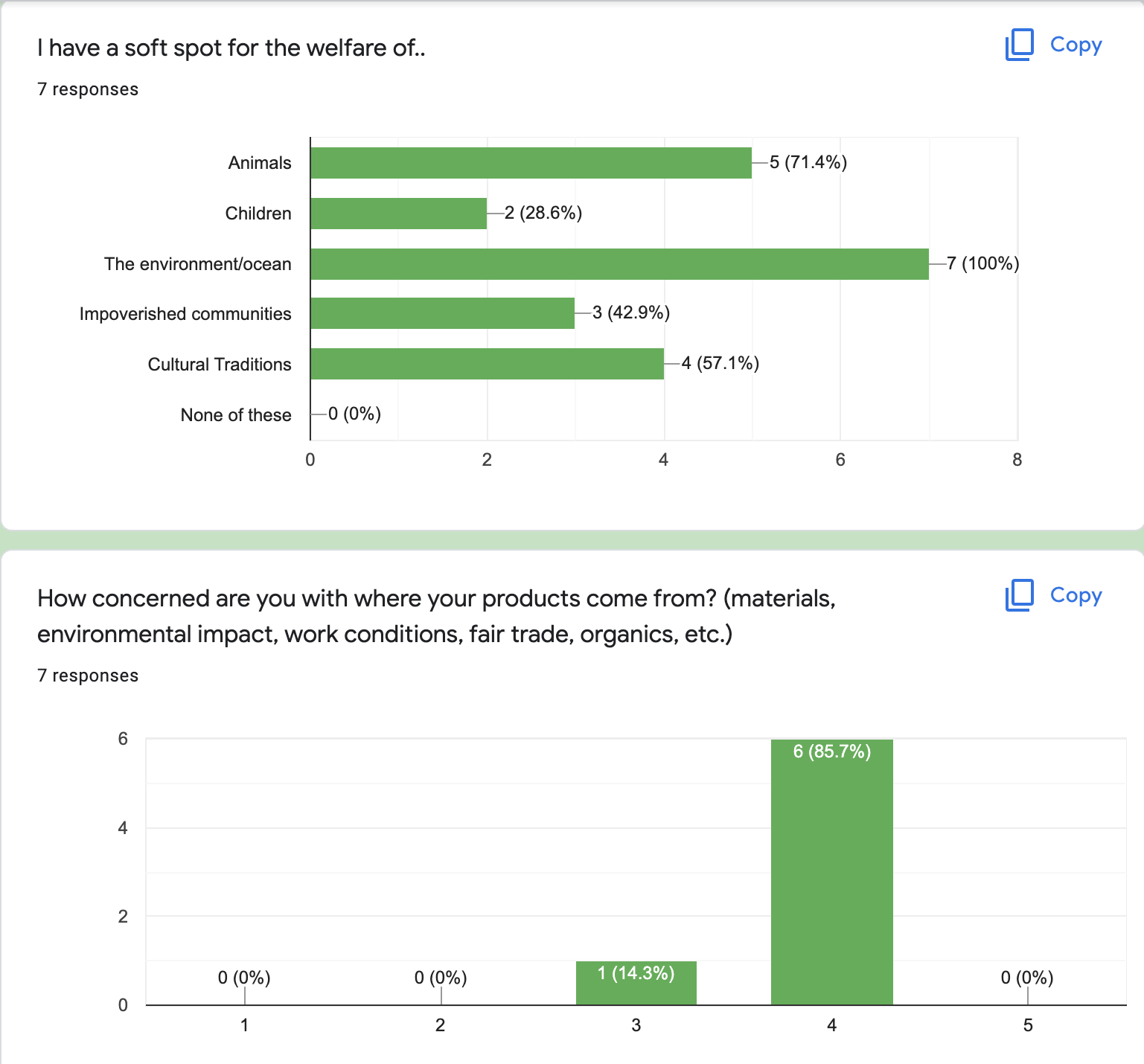

Insights:
All users have a soft spot for the environment & ocean, and most others also had concern for the welfare of animals
The biggest concern while traveling is budget (85.7%)
The biggest concern while shopping for travel gear is longevity (71.4%)
All users will sometimes pick the more expensive option if they know it is sustainable
Most users said they would be more convinced to shop sustainably if they were more aware of environmental issues impacted by travel
“How Might We”
After gaining the insights above, I asked myself, “How might we get people to choose sustainable products even though budget is their top concern?”
Perhaps I could find a way to emphasize how certain products are better for the welfare of the planet/ocean/animals? I know that people will sometimes pick the more expensive product if they know it’s more sustainable.. so my new focus was on how I could formulate the right copy and design to make that happen.
User Personas
With all the information I gathered while researching, I created the following user personas to better understand my audience:


Designing the Experience.
Content Mission Statement
I used this statement as the baseline for which I built my style guide, developed information architecture, and wrote copy for the user interface.
“OffsetTravel is a place where environmentally conscious people of all ages can go to find sustainable travel gear that lasts. Our goal is to educate and uplift travelers who want to lower their carbon footprint through sustainable travel.”
Content Style Guide
To ensure the copy, messaging, and voice were consistent I created a mini content style guide:

Features
I made a list of all the features OffsetTravel should have. Then I sorted them based on their priority level.
I thought it would be good to offer a variety in terms of ways to shop. A user has the option of shopping with the search bar, by gear category, or by trip.
In order to persuade users to shop sustainably (even when it’s more expensive), I wanted to implement an impact section on both the product page and during checkout.

User Journey
Since this was an individual project and had to be completed within 3 months, the scope was limited to the principle user journey of purchasing a product.

Wireframes & Mockups
I sketched some rough wireframes on my iPad to help visualize the layout and information hierarchy of the website.

I then mocked up some medium fidelity prototypes in Figma.

Usability Testing
I conducted an unmoderated user test with 2 participants. 1 male and 1 female, both travel enthusiasts with a moderate concern for environmental issues.
My main insights fell into themes of clearer CTA buttons, consistent terminology, and debatable features. Specific insights were the following:
Things could be more clear above the fold on the homepage (Emphasize “sustainable travel gear that lasts”)
“Get Started” CTA is confusing. Users were unsure what exactly they would start after clicking the button
Trip vs Adventure terminology, are they the same thing?
“What’s Next?” CTA button during the shopping flow is confusing.
What’s the difference between “What’s Next?” and “Skip the Backpack”? Are both necessary?
Here are a few examples of how I iterated on the design based on these insights:


The Final Design
Takeaways
I really enjoyed this project and am proud of the final result. I was able to combine my passions for travel, sustainability, and conscious consumption into one product, which I feel is a great solution for travel lovers who want to offset their environmental impact in the context of travel.
I would love to further test and iterate on this product. Given the chance, I would test it with many more users to gauge the need and solution level of a website like this. I have heard many folks in the travel community discuss sustainability more and more, and I feel a unique shopping option with sustainability in mind would be useful to many.